Subscribe to:
Post Comments (Atom)
Sarah Leal - week 13
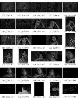
Couldn't shoot with my DSLR this week sorry for the low q :( but I tried experimenting with lighting for the precursor to my ...

-
Some are funnier than others, some need help with the titles. If you have feedback on what could make a titl...
-
Watch out for those snakes in your life. WHAT A MODEL. SLAY ME HANNAH SLAY.
-
depth of field shallow medium deep stop motion blur motion panning times of day morning aft...


Hannah, I think you shot well with the theme of your song, and that you used the elements discussed in class. I enjoyed how you used your model in your composition, and the quality of light is used brilliantly throughout your shots. I suggest that you pay attention to making some of the elements more apparent. Overall great work!
ReplyDeleteYou have great values in your outdoor photos. Also, your experimentation with various angles is successful.
ReplyDeleteThe symmetry in some of these are so pleasing to the eye. The glasses image is great to me just because the lens flare is one of my fav "accidents"
ReplyDeleteThe symmetry of the first shot and blanket texture in the last shot are absolutely lovely. I felt like the first photo could have been a movie still. As for the last photo, the sunlight that passes through the blanket helps to emphasize it's texture--it looks so soft and light. You picked a very good angle to photograph from.
ReplyDeleteThe thorough feeling of wing throughout your ten images parallels the narrative of the song really well. Your best compositions that gave a sense of wind was in the mid day lighting.
ReplyDeleteYour 7th photograph shows strong contrast between the white of the crumpled note and the subject's skin which works well for the composition. Overall, I feel that your photos work well with the song, good work!
ReplyDeleteGreat symmetry in the first, sixth, and seventh photos. The close up of the patterned striped shirt is also very successful.
ReplyDeleteThe symmetry in the first photo is well applied. Additionally the contrast and sense of motion in the second photo is very successful. If the cloth in the last photo was a bit darker it would be easier to discern the form.
ReplyDeleteThe photo pf her mouth has wonderful contrast, and your use of symmetry in the 6th and 7th was well executes. The last photo was a a bit over exposed, but overall a job well done.
ReplyDeleteThat seventh photo is great! I think that’s a really great idea for showing texture. At least for me, it made me feel like I had a wad of crinkled paper in my mouth and made me wonder what that’d feel like which is what I think texture in photos is all about. You were smart with your line choices as well. The fifth photo especially has a lot of smart choices with how parallel her body is in contrast to the vertical trees and pole with the sidewalk lines leading back towards her hand. Great work!
ReplyDeleteur 9th image is absolutely stunning. if im not mistaken the grainyness in that photo is due to a high iso but i think it fits very well with the whole "reflection" idea, makes me feel like im looking a snapshot of someones memories. the soft and shallow depth field also make this photo very cozy! great job!!
ReplyDelete